MY KINGDOM FOR A BRAND
Representing who and how I am
This is a fairly comprehensive breakdown of my personal branding Kahchunk. This brand was initially devised in early 2020 but was revised in 2024. I outline my influences, procceses, and highlight what has changed since it's conception.
Inspiration: Today, I go for the gusto
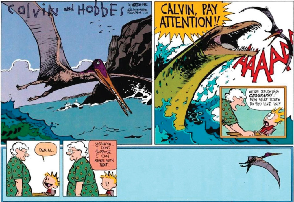
Calvin and Hobbes is a timeless comic strip by Bill Watterson that I still come back to after discovering it roughly 24 years ago. Watterson would inject his humour, life lessons, and unique interpretations of childhood imagination into a few panels that would always be impactful. He was especially keen on using the Sunday's larger and colorized spaces for his work in ways that memorably blended illustration with graphic design. Relative positioning of frames and content helps to convey the underlying thought driven home through Calvin and Ms. Wormwood's brief exchange. You become sucked into Watterson's particular form of storytelling easily, getting lost between beautiful backgrounds, characters, and witty exchanges. It just can't be helped.
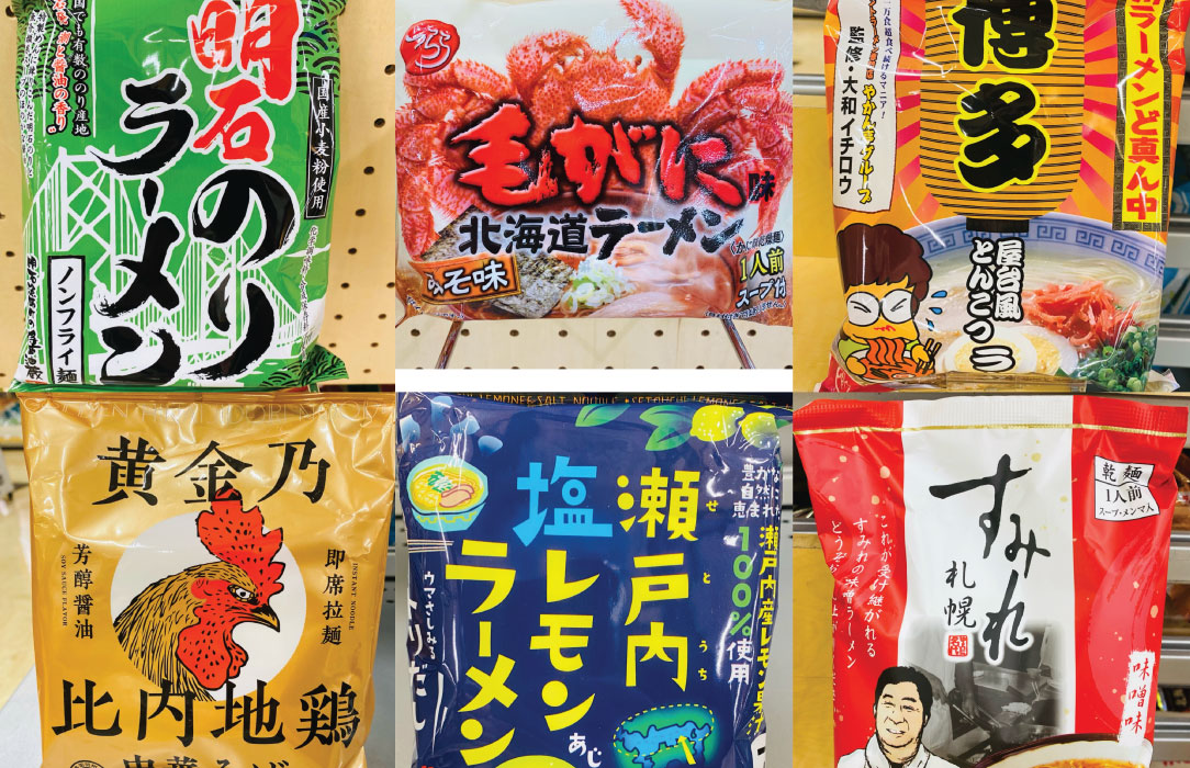
What does Japanese packaging, an old comic strip, construction paper, and the work from a teacher of an art school shutdown by the Nazis have in common?
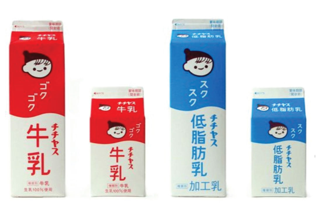
Japanese packaging has a pretty striking spectrum of design. It swings from simple, graphic shapes that feel endearing, to loud and exciting. I've always been drawn to it, in part due to my inability to read the characters so they begin to become part of the design as shape, but also how it demands attention in an approachable way.
Expressive but functional
Both Calvin and Hobbes and Japanese packaging look as if they are having fun and they are happy to show it. Design should be a healthy mix of playful expression and functionality. No personality means you get a slew of basic sans-serif set in a ridgid grid with no mindfulness to the effects of color and perception of space. It's also how you arrive at bland naming, such as all the startups with -ify suffix's. You don't have to bring who you are into the work, but you should bring WHAT you are, a human being with a focus on creativity as a profession.
To work but play
I've always been curious of the world at large and want to soak up as much information as I can. This childlike curiousity still permeates through my work process, with alot of "what happens when I ___" which has encouraged my experimentation and lead to interesting results, such as creating and executing a procedurally generated design workflow in a few hours. It's not without it's potential pitfalls though, I'm not a slave to a muse, waiting on ideas to strike. Nor do I randomly through shit against the wall. I'm still largely driven by a logical top down form of information processing. It's just part of who I am. I'm trying A,B, and C, to find a unique way to get to Z. Between strange and unexpected designs there is an underlying purpose, a core concept that is driving it all. I create purposeful limitations, a fenced pasture for me to explore. The limits keep me focused, the pasture keeps me interested.
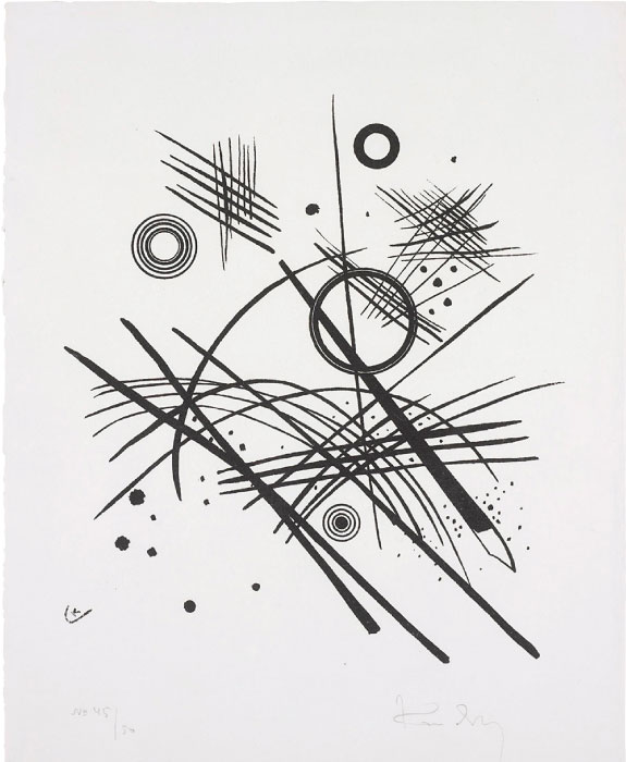
It's not all that different from Wassily Kandinsky, a Russian Painter and Printmaker who was one of the initial teachers at the Bauhaus School in Germany. It was eventually shut down by the Nazi party (shocker I know, fascists wanting to control expression) but there are still wide ranging impacts that Bauhaus still has on the design world. From the concept of taking classes in a variety of mediums to become a better craftsperson, to modular housing to reduce cost and increase accessability. Kandinsky in particular is most well known for his paintings but I've alwas been more drawn to his woodblock prints. What seems like chaos at first, is a very organized layering of complex information that has a clear hierarchy and intent. Directional forces subjugated to the power of form, bent to the layering of intersections. You take any piece out and the piece feels different, sometimes drastically so. Everything is planned and purposeful.
Made by hand but never touched
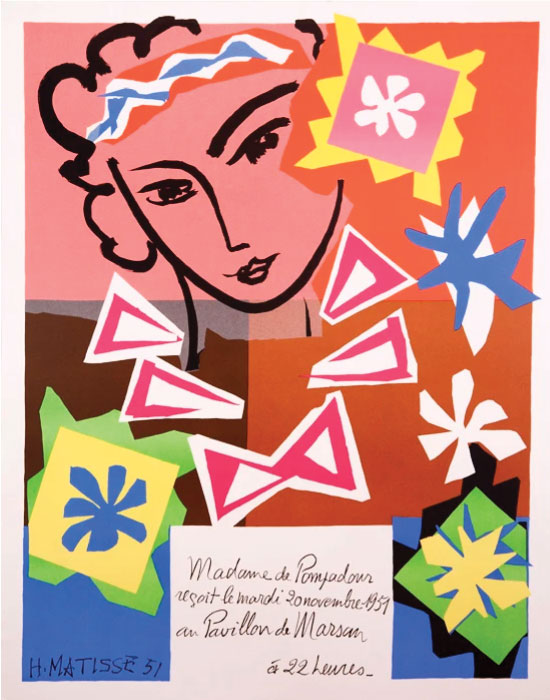
The last major point of inspiration is the works of paper by Henri Mattise. A Russian painter known for his colorful interpretations of the world, in his older age it became difficult for him to paint and he eventually realized he could fill the world with color via construction paper. The usage of construction paper was also utilized by The Bauhaus for educating students on the complex interactions and interpretations of color and form. Mattise's work is playful, full of life, and created by hand.
The challenge of living in the digital age and being a designer is how little you can physically interact with your work. There's almost always just an interface, mouse, and a keyboard. To top it off, what you see is not what you always get. You have to be educated to understand the differences between color spaces, the limitations of color reproduction from a digital environment, and flexible to the printing press's imprecise nature.
So how to combine the feel of what's been made by hand when my hands are arguably not even making anything at all?
Clarify the intent, and modify it to my unique needs.
The paper shows the user's interaction through what's been left/removed. It's cut because the user cut it. The answer to the problem is simple, create a base of simple, layerable shapes that appear cut, but maintain clean edges to mesh with all the previous materials.
Naming: Open Sesame
Before any design works begin, the challenge of naming begins. Discerning an impactful and memorable name that has a clear though line is difficult and can take quite alot of time. To help myself out I use "synonym trees" or branching lists that use the synonyms of synonyms of synonyms to find the core descriptors for a brand. Going back to Calvin and Hobbes, Sequential Art was a great medium for inspiration. From detective stories, historical drama, sci fi, you name it, sequential art has it. One of the few things it also has that is rarely used by any other medium, is the visualization of sound, or onomatopoeia.
It's a start but even here I have to be catious. Words carry baggage, pre-conceived notions, ideas, whole belief systems. A BLAM conjoures different imagery then a SNIKT. I want human, relatable, experience driven, but also and most importantly, to communicate the unexpected mix of logical and playful process that is at my core.
It came to me when driving, hitting a pothole on the interstate. KAHCHUNK
Mark Development: Build it and they will come
Now comes the design work, but I don't jump right into opening Illustrator or Figma. Pen and paper allows the quickest form of iteration and you can easily see underlying currents in your interpratations. Sometimes I'll put down an idea that I know is wrong the moment I see it, othertimes I'll hook into a particular stroke of the brushpen, a difference in weight in forms. What I knew for sure going in was that I wanted the name to be a prominent component, not subservient to a logomark.
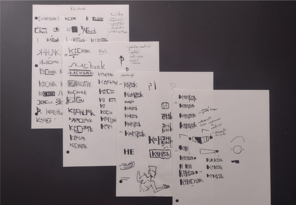
As I continued testing ideas something became clear that I hadn't expected. The annunciation of the name Kahchunk. The difference in sounds between letters drove the relative size of it's partners. The letter K is harsh and sudden, it cuts off whatever is being said before and is always clear. The CH- sound is similiar at first thought but when you say it aloud a few times you begin to realize that it's much softer, with an audible easing in and easing out.
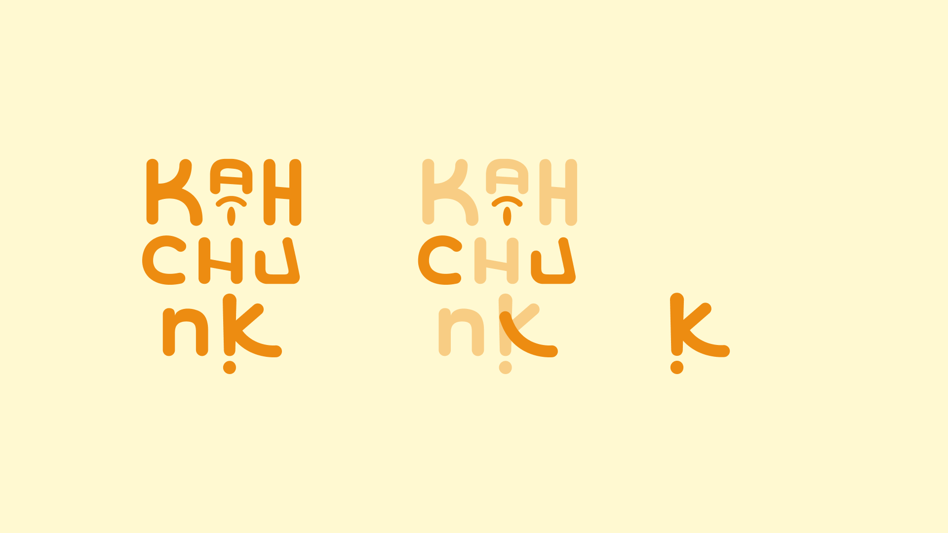
Building off of this realization, I began to stack the letters, utilizing verticality more to create a condesned mark that would flow better in a digital world. Upon inspecting one of my last versions, I saw an opportunity to hide the imagery of a face, a clear tie to my narrative nature when designing (and writing). This compounded with the tightening of all the decisions before resulted in something that surprised even me. A logotype, with a hidden image, that also contains a logomark that underscores everything mentioned before.
Reduce, reuse, revise
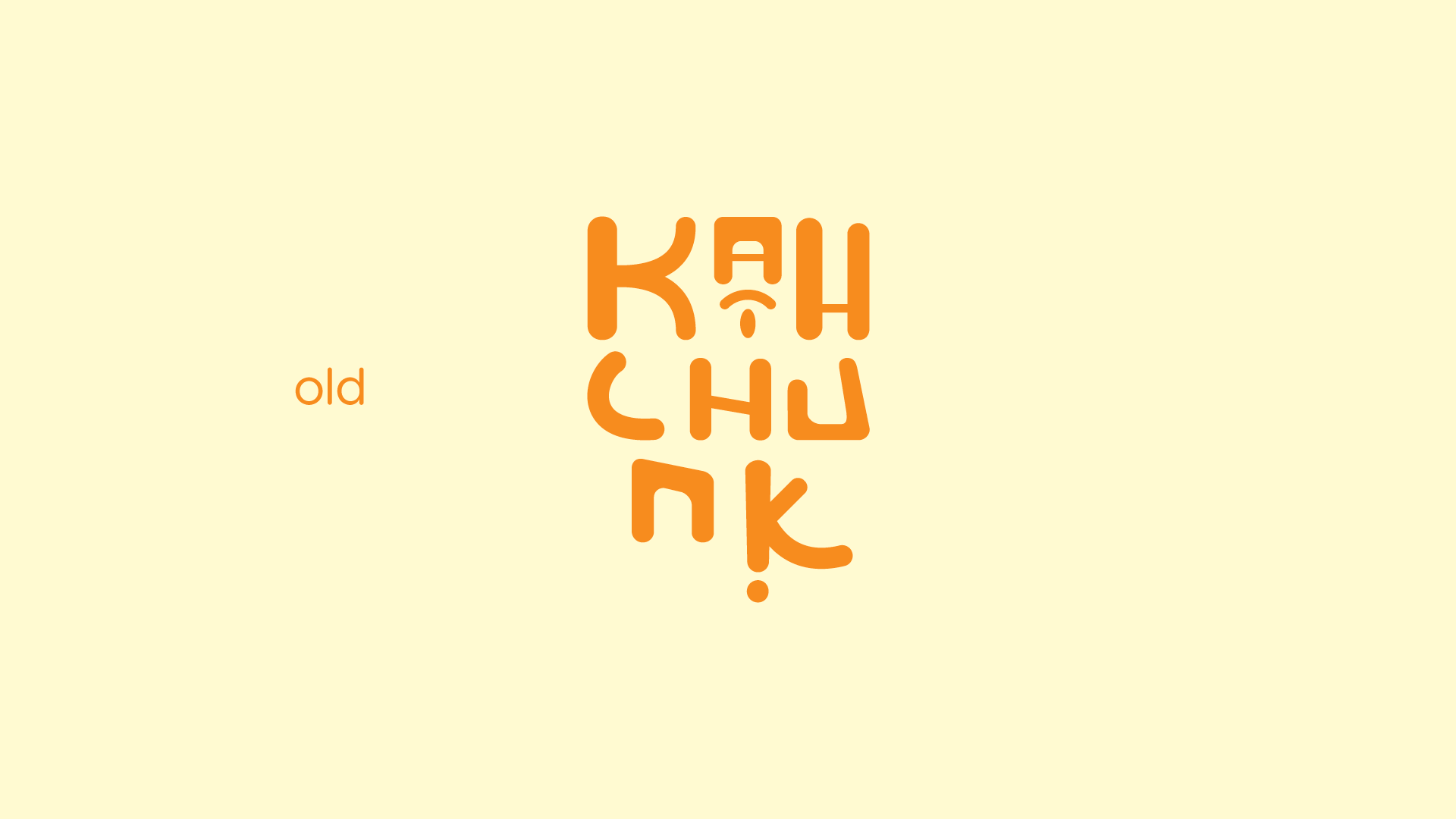
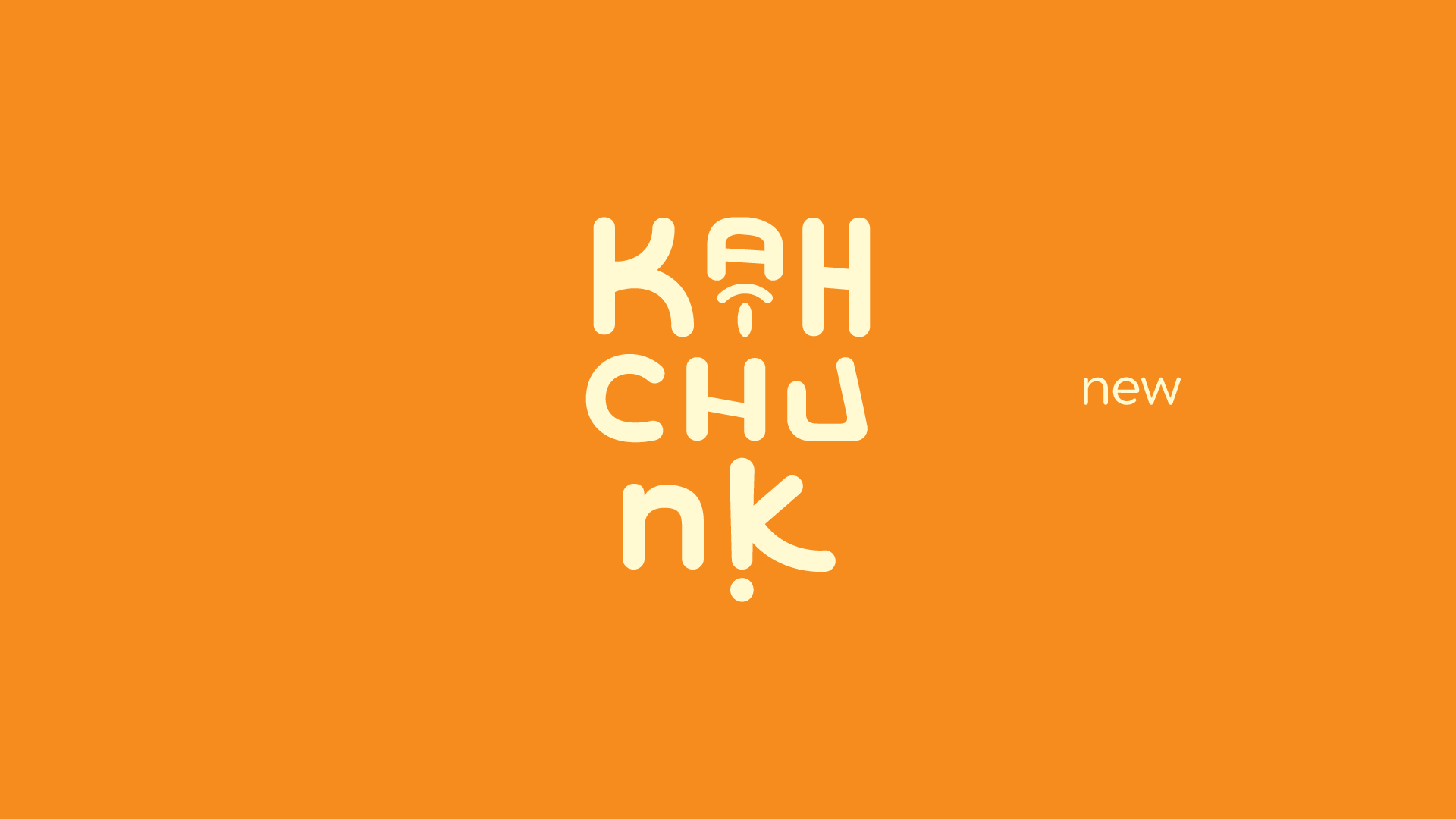
In late 2024 the branding was updated. Everything was reassesed and found wanting to me. The biggest culprit was the logomark itself. I wanted greater ease of legibility, and a more consistent continuation of design decisions. This meant less variation in width, less blocked in feel (especially along the top terminals), and a bit more breathing room. The hidden face was also better balanced with significant changes to the letter c. Overall the mark feels more polished and lays in better with the type pairings
Colors & Accents: Filling it all in
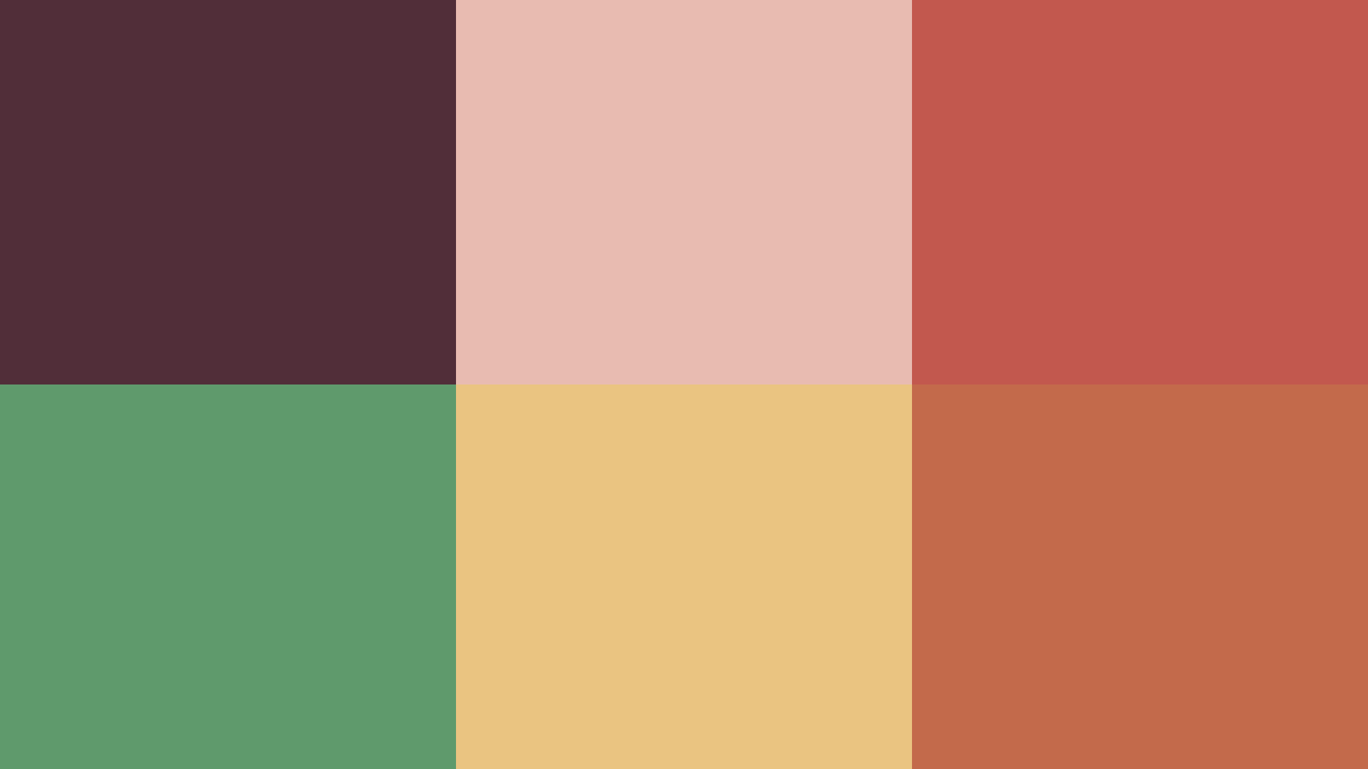
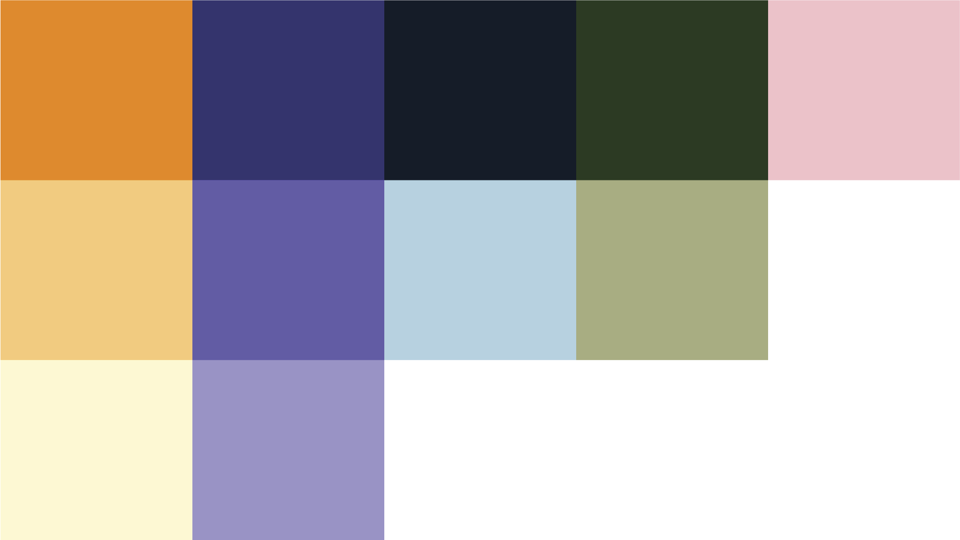
Revised in 2024, the color pallete leans heavily on my use of warm/cool and analogous color palletes in my personal work the past few years. I've reduced the overall chromasticity of the pallete so that colors could easily lay on top of each other in high quantities without creating clashing swathes of undesired contrast.
