HashiCorp Brand Update
IDENTITY | SYSTEM DESIGN
In June 2025 HashiCorp was aquired by IBM and a revenue target of $1B was set for end of Q4 2026. I lead a massive brand update to better mesh HashiCorp into the existing standards of IBM while retaining it's core identity, to create a seamless customer experience. The most pressing clash between the two was IBM being lightmode only and HashiCorp being dark mode only. Add on to this the challenge of finally seperating brand identity from our product suite treatments to maintain clarity of voice and the breadth of the challenge became significant. I started with an analysis of our current colorations and guidance, or the lack thereof, and evaluated exactly how our voice was inconsistent.

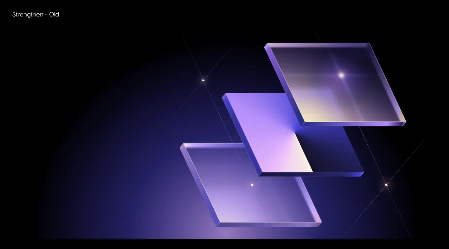
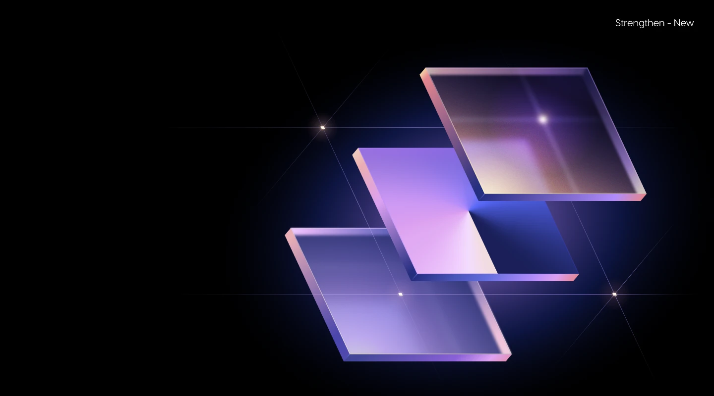
The old library at left was entirely derived from our product colors. The colorations were not web accessible, print friendly, or meshed with each other well for our numerous gradient treatments. The new colors harkened to some of the most relevant products, while being flexible enough to be leveraged in our “flooded with light” aesthetic. The final product was added to a design library I’d built and maintained of over 1200+ assets. This made design for low to medium level lifts signficantly easier and created better cohesiveness between materials that had previously been scattered. Regardless of what path the customer's journey took, HashiCorp was now clearly estabalished in it's execution, reducing friction and increasing appeal.


6
new color bands

56
total colors

AAA
compliance on web designated colors
I also estabalished pre-determined gradients with clear markup for other designers and vendors. While the image below doesn't include the examples in from the library itself, it showcases how the colors operate in light and dark mode, creating a consistent feel to our communication and customer experience.

Old vs new, merged with IBM'S sales process
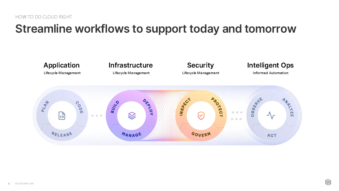
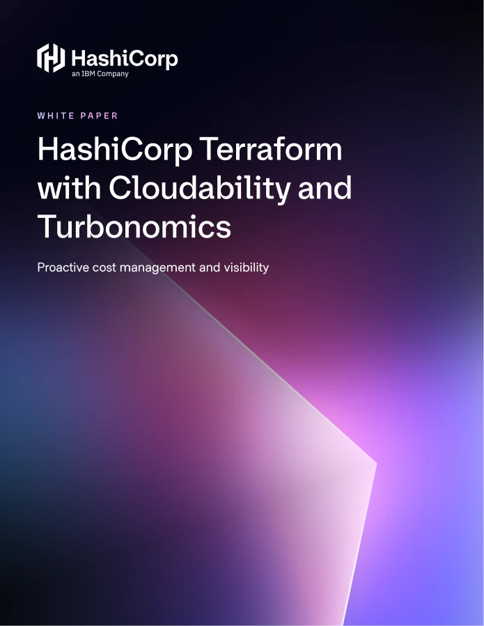
After developing the palette we began converting all our materials to the new system, such as the decks, whitepaper, and product briefs. Some materials, primarily socials, and web, remained dark mode as they are moments specific to our brand voice, while others that were used in the sales process were converted to light mode. The new palette allowed these materials to coexist and extend the reach of the brand while being flexible enough to work within IBM's estabalished layouts.
![[FINAL PRODUCTION] FY26 Pitch Deck (10) 1](https://kahchunk.com/wp-content/uploads/2026/03/FINAL-PRODUCTION-FY26-Pitch-Deck-10-1.webp)