Saber Interactive brand refresh
WEBSITE DESIGN | BRANDING
This is part of a cold pitch / personal work.
Saber Interactive (Saber) is a large videogame developer with operations in multiple countries with over 1k employees. Founded in 2002 in Russia, the company has begun acheiving larger success since 2019 with titles such as World War Z, Space Marine 2, and ports of popular games such as The Witcher 3 for the Nintendo Switch.
With this increase in reach the were bought out buy Embracer, which was then sold back to the cofounder in 2024. This changing of hands and larger presence is a great opportunity for the company to re-evaluate it's core brand and web experience to raise the bar across the board.
Saber's core demographic appears to be males ages 24-40. Their genres are typically Shooters (ex. World War Z) and Industrial Builders/Transportation (SnowRunner, RoadCraft).
Logomark

The Saber Logo has always retained the Saber cat as a key component. It's always appeared to be aggressive, reading emblematic of the company's willingness to take on challenges that others might shy away from. To be focused and determined as they achieve constant growth and their ultimate prize, a company that dominates the game development space. However the most recent iteration post Embracer group sell-off feels static, and the cat itself feels more like it's opening it's mouth, not as if we've caught it mid lunge.
My revision keeps the core of the cat from over the years, the triangular eye, wide jaw, the cut behind the ears and jaw that feel assertive and create an impactful silhouette. I've refined what's always been present, creating a contour from head to snout, with an incision for the nose. The jaw was heavily reworked with a shape the flows more smoothly, and teeth that break that flow while reinforcing heavy rightward momentum.
The Saber text was originally set in Phonk with a handful of manual adjustments, however i felt that the typeface was a bit too chunky and the negative space was very uneven. It's been reset with Macrosoma Grotesque Loose Bold. Adjustments to the R were made so it wasn't as shaped and a slight obliquing was applied to reinforce the left to right movement. For built small (below) additional adjustments were made to the A, opening it up considerably for legibility.
The logo has some intricacies that can be lost at smaller dimensions so there's also a "built small" version for usages under 72px including clear space. Main differences are slightly wider openings in the ear, jaw and nose, and a rounding of the negative space in between the teeth since sharp points get lost at small dimensions. This version is typically used for logo bugs, social profiles, and some ads (with proper vertical or horizontal full lockup).
Color palette and Typography
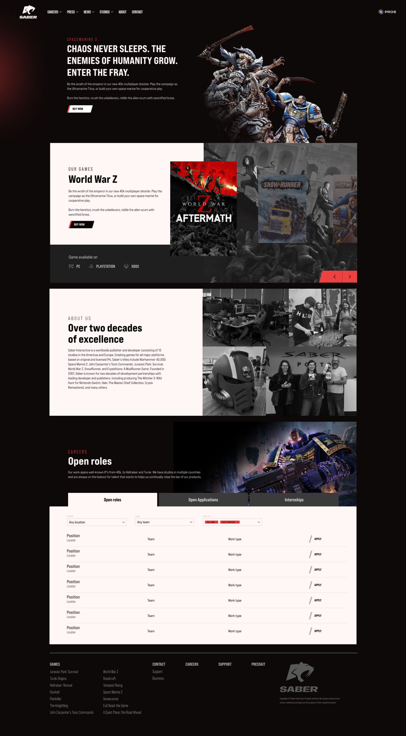
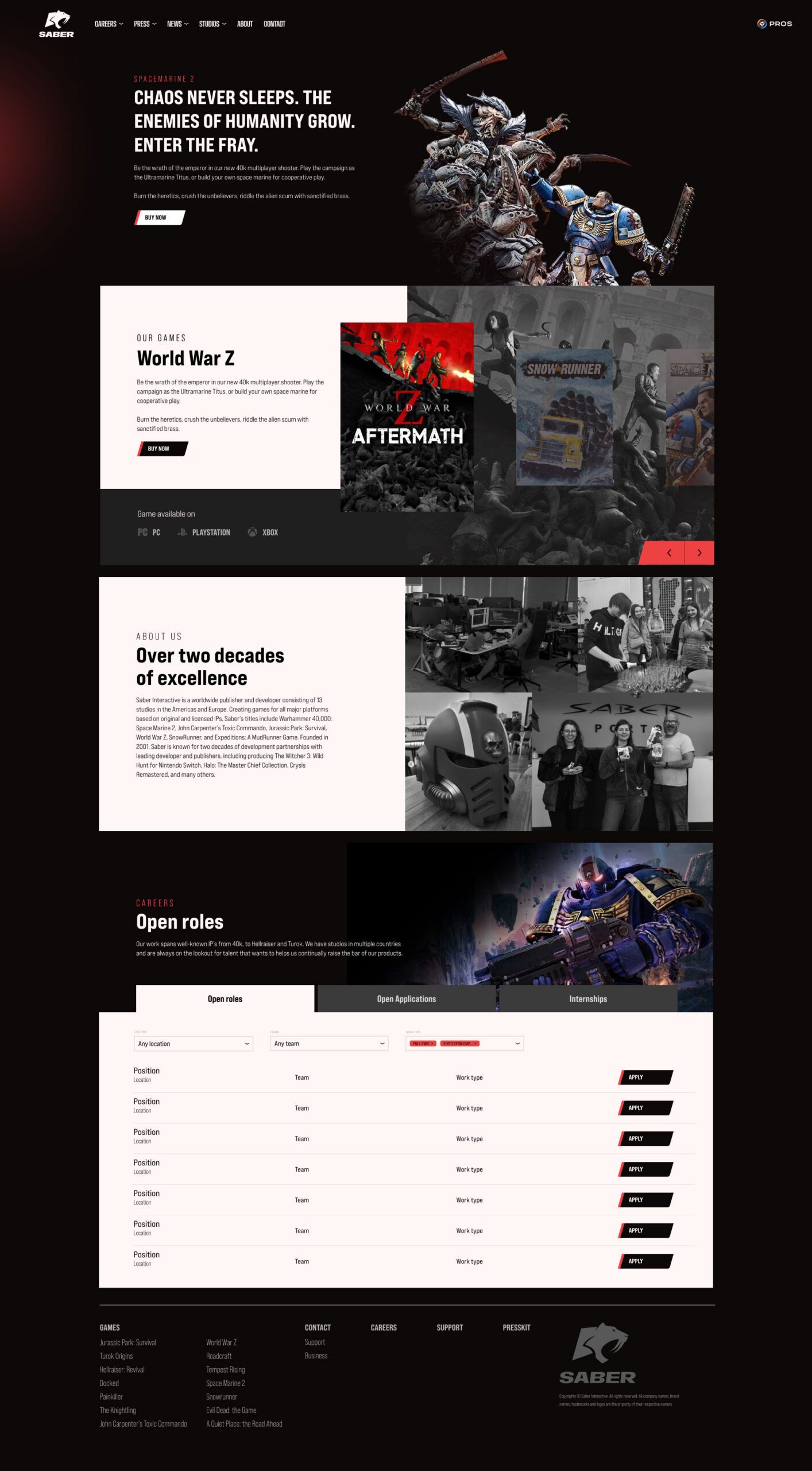
Saber has and will continue to be an "on dark" company, but now features hints of red in it's primary scheme. It's energetic and demanding, while also allowing our new black and white to stand out on pure black and white backgrounds without being jarring. The pallete overall is simple, predominatly grayscale, using the core Saber Red for high conversion/engagement points like buttons, and carousel sliders. An optional Saber Red 2 is used only for clarifying hoverstates where Saber Red is used.
All Saber materials are set in Bebas Neue Pro, a fairly tall somewhat industrial and bold typeface. It's numerous weights leave ample room for clear hierarchy, and continued exploration of the brand.


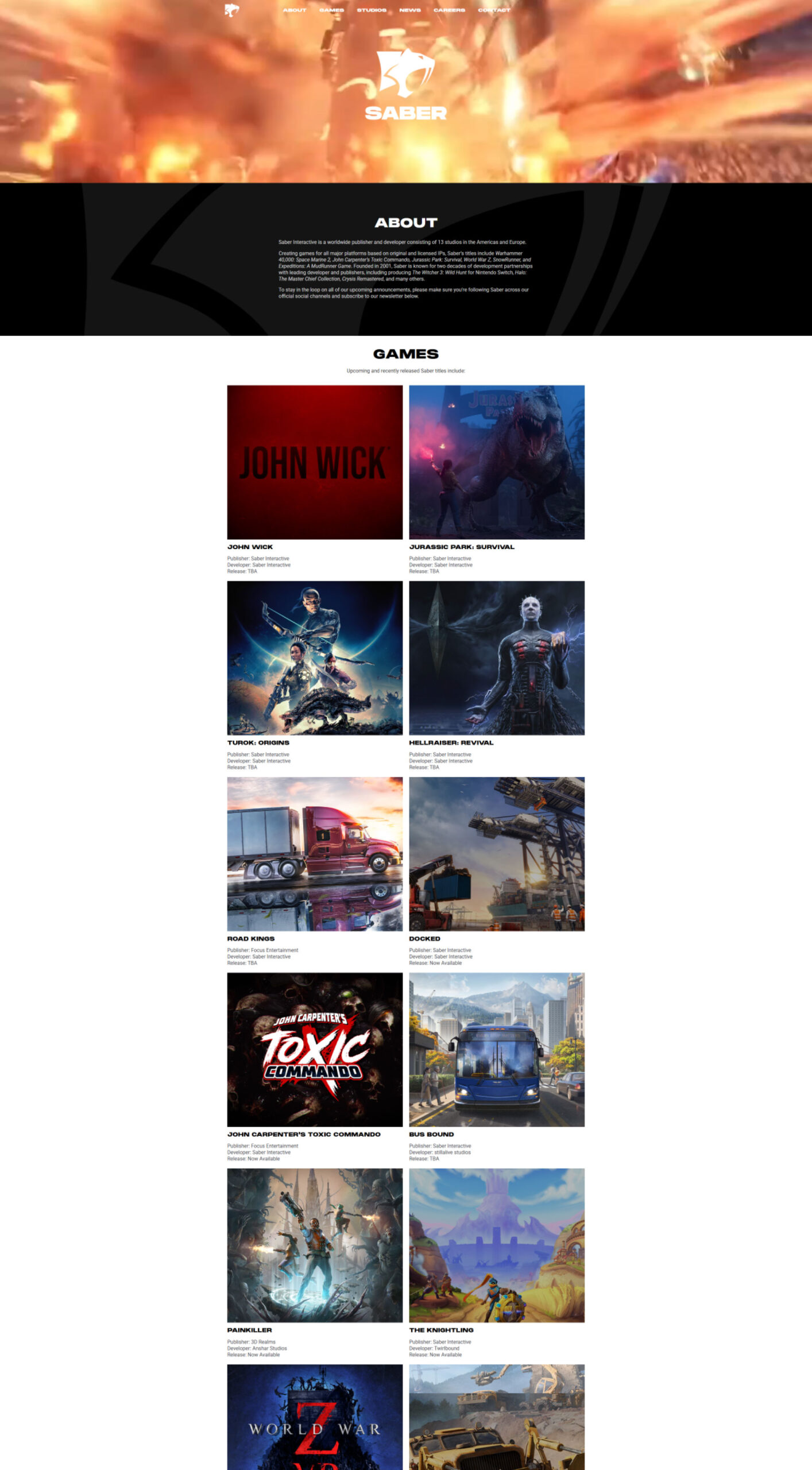
Website
The website is a significant pain point, it doesn't communicate anything about the brand and isn't interesting for a user to explore. There's nothing to keep the user engaged and potentially convert a curious customer into a sale. I've rebuilt the site from the ground up, working within the confines of Elementor (what they currently use) with flickity for carousel support. I've also used the homepage as an opportunity to convert Prism Ray Online Services (PROS) users into additional conversions, instead of it being found only as a link through in game UI. Users link their supported games to their PROS account to gain rewards, transfer their saves to different platforms safely, view their in-game statistics, and keep track of important game updates and events by e-mail. Something as significant as PROS should be included as a core website traffic point.